Saturday, June 25, 2011

How often does the Best Team Win?

This year’s Stanley Cup Final concluded with a somewhat surprising outcome. The Vancouver Canucks – who were widely regarded as the league’s best club – were defeated by the underdog Bruins.

To those who regard the NHL playoffs as a competition designed to determine the league’s best team, the result can mean only one thing – that the Bruins were the best team all along, and the Canucks mere pretenders.

A more reasonable explanation, however, is that shit happens over the course of a seven game series and, because of that, the better team doesn’t always win. The Canucks were better than Boston during the regular season, and were likely better in the first three rounds of the playoffs as well. They were better than Boston last year and there’s a good chance that they’ll do better next year. They were probably the better team.

The Canucks may or may not have been the best team in the league, but if they were in fact better than Boston, then that means that a team other than the best team in the league won the cup. That raises an interesting question – how often does the best team in the league end up winning the cup?

(The answer, of course, will vary as a function of the level of parity that exists in the league. Because the level of league parity has varied over time as a function of era, we’ll confine our answer to the post-lockout years).

Unfortunately, the question cannot be answered directly due to the fact that it’s not possible to identify the league’s best team in any given season with any certitude. One can only speak in terms of probability and educated guesses.

It is, however, possible to arrive at an approximate answer through assigning artificial win probabilities to each team, simulating a large number of seasons, and looking at how often the team with the best win probability ends up winning the cup.

This exercise is made possible by the fact that the distribution in team ability – which we’ll define as true talent goal ratio –can be ascertained through examining the observed spread in goal ratio and identifying the curve which best produces that spread when run through the appropriate simulator.

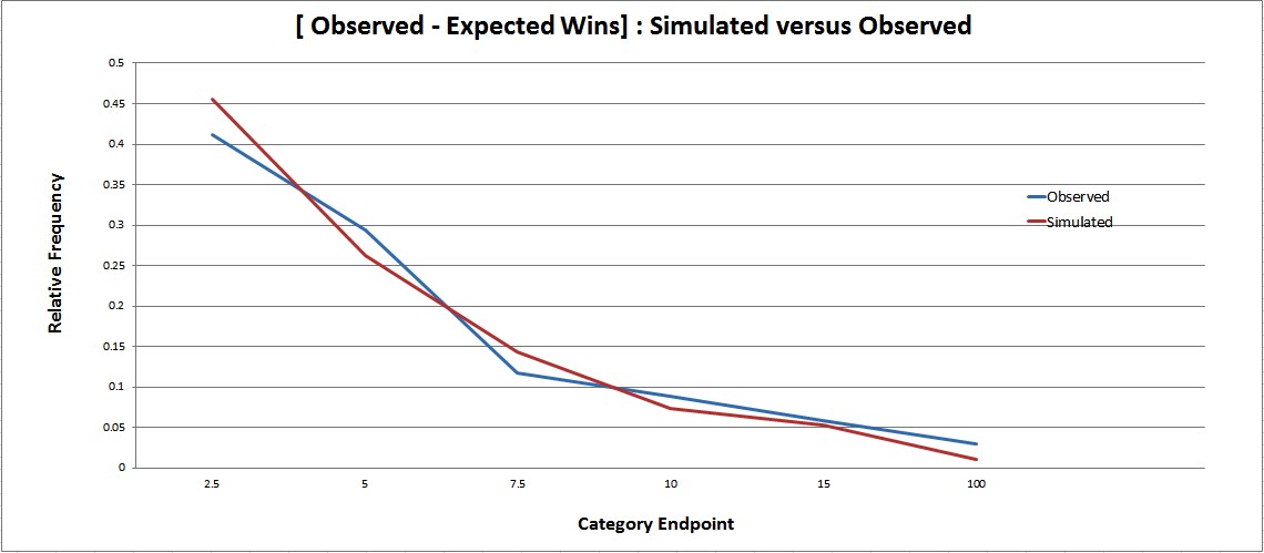
In order to generate an observed distribution of results, I randomly selected 40 games from every team and looked at how each of them performed with respect to goal percentage (empty netters excluded) over that sample. This exercise was performed 2000 times for each of the six post lockout seasons. The following curve resulted:

The likely ability distribution is the curve shown below – a normal distribution with a mean of 0.5 and standard deviation of 0.03.

If a large number of half-seasons are simulated through assigning artificial goal percentages based on the above ability distribution, the spread in simulated results closely matches the observed results displayed in the first graph.

As the ability distribution can be used to generate results that closely parallel those observed in reality, it can also be used in order to answer the question posed earlier in the post – that is, the probability of the best team in the league winning the cup in any given season.

Here’s how the simulations were conducted:

  • For each simulated season, every team was assigned an artificial goal percentage based on the ability distribution produced above
  • The artificial goal percentages were, in turn, used to produce GF/game and GA/game values for each team
  • GF/game values were calculated by multiplying a team’s goal percentage by 5.49 (5.49 being the approximate average number of non empty net goals scored per game in the post-lockout era)
  • GA/game values were calculated by subtracting a team’s GF/game value from 5.49
  • All 1230 games from the 2010-11regular season were then simulated, with a score being generated for each individual game
  • The probability of a team scoring ‘x’ number of goals in an individual game was determined through taking its GF/game value and adjusting it based on the GA/game value of the opponent
  • If each team scored an equal number of goals, each team was awarded one point and a random number generator was used to determine which of the two teams received the additional point
  • After all games were simulated, the division and conference standings were determined in accordance with NHL rules (that is, with the teams ranked by points, with the division winners being placed in the first three seeds in each conference)
  • If two teams were tied in points, greater number of wins was used as a tiebreaker
  • If two teams had the same number of points and wins, then a random number generator was used as a second tiebreaker
  • The playoff matchups were then determined based on the regular season standings
  • Individual playoff games were not simulated; rather, each series was simulated as a whole based on the Pythagorean expectations (which were derived from the goal percentage values) of the involved teams
  • Home advantage for the higher seed was valued at +0.015

20 000 Simulations were conducted in total. Here’s how the league’s best team – defined as the team with the best underlying goal percentage in each individual season – fared. We’ll start with the regular season results:

The above chart shows how the best team performed in four areas – division rank, conference rank, league rank in points, and league rank in goal differential. So, as an example, the best team ended up winning the President’s Trophy – i.e. finishing with the most points – about 32% of time.

The results are interesting. The best team does very well in general, but the range in outcomes is considerable. It wins its division a majority of the time yet still manages to finish dead last every now and then (about once every 200 seasons). It wins the conference almost half the time and finishes in the top four about 84% of the time. However, it still misses the playoffs a non-trivial percentage of the time (2.2%). The latter fact may not be too surprising – the 2010-11 Chicago Blackhawks were close to being the best team in the league but only made the playoffs by the slimmest of margins.

It wins the President’s Trophy about a third of time and does even better in terms of goal differential, posting the best mark in roughly 40% of the simulations. However, it occasionally finishes in the bottom half of the league in both categories (about 2% and 1% of the time, respectively).

The graph below shows the distribution in year end point totals for the best team. It averaged just over 107 points, with a high of 145 and a low of 73.

And the distribution in goal differential (mean = 57; max = 161; min= -34).

Finally, the chart showing the playoff outcomes for the best team, and therefore answering the question posed earlier.


It turns out that the best team wins the cup 22% of the time – about once every five seasons. This accords well with what we’ve observed since the lockout, with the 2007-08 Detroit Red Wings being the only cup winner that was also unambiguously the best team in the league. The 2009-10 Chicago Blackhawks were probably the best but it’s hard to say for sure. The 2008-09 Penguins were a good team but the Wings were probably better that year. Ditto for the 2006-07 Ducks. The 2010-11 Bruins were merely a good team, and I can’t even say that much for the 2005-06 Hurricanes, who may not have even been one of the ten best teams in the league during that season.

Caveats:

The exercise assumes that team ability is static. This is obviously untrue in reality, given injuries, roster turnover, and like variables. Consequently, the best true talent team at one point in the season may not be the best team at a different point. Moreover, the spread in team talent at any given point in the season is likely to be somewhat broader than the ability curve used in the exercise.

Scores were generated for individual games through the use of poisson probabilities, which does not take into account score effects. Thus, the model slightly underestimates the incidence of tie games. For the same reason, it also overestimates the team-to-team spread in goal differential.

Tuesday, June 7, 2011

Predicting Playoff Success - Part Two

Rob Vollman raised an interesting question in the comments section of my last post, that being whether my findings precluded the possibility that some teams consistently perform better or worse in the playoffs.

The question can be answered by comparing each team's actual performance, as measured by winning percentage, with what would be expected based on regular season results. If the spread in [actual - expected] winning percentage is significantly greater than what would be expected by chance alone, then that suggests that some types of teams may consistently outperform or underperform in the playoffs relative to the regular season.

As with my last post, my sample consisted of all 1882 playoffs games played between 1988 and 2010. I've prepared a chart which shows, in the leftmost section, how each of the league's teams performed during that span. The middle section of the chart shows each team's expected wins and losses, based on single-game probabilities generated from regular season data. Finally, the rightmost section shows each team's winning percentage differential (defined as observed winning percentage minus expected winning percentage), as well as the probability of observing a differential at least that large by chance alone.

That last part may require some elaboration. All 1882 games were simulated 1000 times, based on the regular-season derived probability values. For each of the individual simulations, I determined each team's winning percentage and subtracted from it that team's expected winning percentage. The p value column simply indicates the proportion of simulations in which the the absolute value of that number - that is, the team's [simulated winning percentage - expected winning percentage] - exceeded the absolute value of that team's [observed winning percentage - expected winning percentage].

A specific example may be illustrative. Anaheim had an observed winning percentage of 0.576, an expected winning percentage of 0.462, and therefore an [observed winning percentage - expected winning percentage] of 0.114. In only 0.033 of the 1000 simulations did Anaheim's simulated winning percentage differ from its expected winning percentage by at least 0.114. Hence Anaheim's p value of 0.033.


As can be seen, some teams outperformed their expected winning percentage, whereas others underachieved. Based on each team's [observed winning percentage - expected winning percentage], and the probability of each differential materializing by chance alone, Edmonton, Pittsburgh and Anaheim were the three most "clutch" teams, whereas the Islanders, Columbus and Atlanta were the biggest "chokers." But is the spread between the teams any different from what would be predicted from chance alone?

There are two ways in which this question can be answered. The first is to group the observed winning percentage differentials ( expected versus actual winning percentage) into several categories, and calculate the number of values in each category as a percentage of the total sample (relative frequency). Following that, the same can be done with the simulated differentials. The two distributions can then be compared.

The second is to repeat the exact same exercise, but to use actual wins instead of winning percentage. I prefer this second method as the fact that some teams, such as Atlanta, Columbus and Quebec, played very few games has the potential to skew the results if winning percentage is used.

Here are the two graphs:


In the case of winning percentage, the actual spread is noticeably greater than the observed spread. But the difference is not too large, there being something of a general correspondence. And in the case of wins, the two lines form almost a perfect match.

If I were to issue a conclusion, it would be that although some teams over or underperform in the playoffs relative to their regular season results, this appears to be mostly the product of normal statistical variation. There isn't much support for the idea that there exists an ability to perform in the playoffs that is independent and separate from the ability to perform during the regular season.
.

Saturday, June 4, 2011

Predicting Playoff Success

It's often said that the playoffs are a different ball game as compared to the regular season - that some teams are built for the playoffs whereas others are not.

The above statement can be evaluated by looking at how well regular season results predict playoff success. This can be done by assigning a theoretical win probability to every playoff team based on how it performed during the regular season, and determining the odds for each individual matchup on that basis. If the statement is true, the favorite - the team with the superior win probability as against its opponent - should win significantly less often than expected.

My sample consisted of all 1882 playoff games played between 1988 and 2010. Theoretical win probabilities were computed on the basis of regular season goal ratio, corrected for schedule difficulty. While goal ratio is imperfect in this respect, the data required to produce more precise estimates is simply not available for the majority of the seasons included in the sample. Thus, goal ratio is the best measure available.

Home advantage was valued at +0.056, this being the difference between the expected neutral ice winning percentage of home teams (0.505), and their observed winning percentage over the games included in the sample (0.561).

After computing the odds for each individual game, I divided the data into eight categories. The category in which a game was placed depended upon the expected winning percentage of the favorite. The cutoffs for the eight categories were as follows:
  1. 0.50-0.52
  2. 0.52-0.54
  3. 0.54-0.56
  4. 0.56-0.58
  5. 0.58-0.60
  6. 0.60-0.625
  7. 0.625-0.675
  8. 0.675-1
The cutoffs were not gerrymandered so as to produce a particular result - I simply wanted each category to contain a relatively equal number of games. As there are many more games in which the favorite has a win probability between 0.50 and 0.60 than there games in which the favorite has a win probability greater than 0.60, this necessitated making certain categories larger than others.

The results:


[The italicized 'n' column simply indicates the number of games contained within each category.]

As can be seen, using regular season data allows one to predict the results of groups of individual playoff games with surprising accuracy. On the whole, the favorite did slightly worse in reality than what the regular season results predicted - 0.573 versus 0.586. However, this is probably just a reflection of the fact that regular season goal ratio is the product of both skill and luck, and that the true talent goal ratio of the average team lies closer to the population average than does its observed goal ratio.

As for the individual categories, six of the eight show a reasonably close correspondence between expected and observed winning percentage, with the other two featuring notable discrepancies. While each gap appears significant, either could be the product of chance alone. The probability of a 0.51 team going 0.468 or worse over 263 games is 0.097. Likewise, the probability of a 0.713 team going 0.671 or worse over 204 games is 0.109.

If I were to guess, I'd say that the discrepancy in the 0.675-1 category is a real effect. As discussed earlier, goal ratio tends to overvalue the favorite and underrate the underdog, and the greater the distance from the mean, the more likely this is to be true in individual cases.
.

Thursday, June 2, 2011

More on Team EV Shooting Ability

About a week ago, I put up a post on team even strength shooting percentage, which included a chart showing what the underlying talent distribution in that area probably looks like. I've reproduced the relevant curve below:


The curve isn't excessively narrow. The 97th percentile equates to a shooting percentage of 0.0902, meaning that, in an average season, the league's most talented EV shooting team would have an underlying shooting percentage at or around that mark. That's no trivial advantage - with neutral luck, such a team would be expected to score roughly 18 more even strength goals than a team with average EV shooting ability.

The problem is that, given that goals in the NHL are somewhat of a statistical rarity, the regular season doesn't provide us with a sample that is sufficiently large so as to be able to identify each team's true talent level with reasonable accuracy.

This estimate uncertainty is well illustrated by comparing last year's Devils, who had a league worst 0.065 EV shooting percentage, with last year's Stars, who posted the league's best mark at 0.089. That seems like a fairly large gap - almost 2 and half percent. Surely one would be able to conclude that the 2010-11 Stars possessed more EV shooting talent than the 2010-11 Devils?

In fact, there is a not-insignificant probability that the Devils were actually the better EV shooting team. This becomes immediately apparent upon viewing the ability distribution for each team and noting the overlap between the two curves.


There is an 11.6% chance that N.J was actually the more talented team last season in terms of EV shooting ability. In other words, there will be some seasons - of which 2010-11 is an example - that do not permit the conclusion that any single team has definitively more EV shooting talent than any other.
.

Monday, May 30, 2011

Stanley Cup Finals 1011 Playoff Probabilities and Predictions


It all comes down to this.

The best team in the West against the best team in the East.*

For the 6th straight year, the Western representative appears to be the stronger team. That's not really surprising - the West has had the better interconference record in every season since 1999-00, and often by a large margin.

I think Vancouver is clearly the better team here and that, if anything, the odds I've presented above understate their chances. That said, these two teams are close enough to one another where it should be a good series.

I'll take the Canucks to win in six games.

VAN in 6.

*As per my probability model. It's possible - perhaps even likely in Boston's case - that neither team is the best team in its respective conference. For what it's worth, I'd take a healthy Pittsburgh team over Boston all day every day. But I digress.
.

Sunday, May 29, 2011

Team Even Strength Shooting Talent

A while back, I received a comment relating to how my playoff probability model accounts for teams that are outliers with respect to shooting percentage, with the 2009-10 Washington Capitals offered as an example of such a team.

The answer is relatively straightforward: I merely regress each team to the league average based on the extent to which the team to team variation can be attributed to luck over the sample in question. As the variation in even strength shooting percentage at the team level is approximately 66% luck over the course of a regular season, each team's even strength shooting percentage is regressed two-thirds of the way to the mean in order to generate theoretical win probabilities.

The application of above method to data from the 2010-11 regular season yields the following even strength shooting talent estimates for each the league's 30 teams.*


This method, however, is actually a shortcut that relies on assumptions that are unlikely to be true in reality. For one, it assumes that all underlying talent distributions are normally distributed, which may or may not be the case. It's also insensitive to the fact that some teams take more shots than others over the course of a season. A more certain shooting talent estimate can be made with respect to a team that takes 2000 shots as compared to a team that takes 1500 shots, although the model fails to reflect that.

The proper - albeit significantly more complicated and involved - approach would be to actually identify the nature of the underlying talent distribution and work one's way forward from there.

The first step is to look at the observed distribution in performance. I did this through randomly selecting half a season's worth of games for each team and looking at how it performed with respect to EV SH% over that sample, and repeated this 2000 times for every season from 2003-04 to 2010-11. I elected to do this as it provided me with 420 000 data points, thereby allowing me to generate a smooth curve. By comparison, using the actual end-of-season frequencies would have provided me with a mere 210 data points.

I came away with the following curve:


The distribution is slightly right-skewed and therefore not quite normal. This becomes meaningful at the tails - there were approximately 26 times more values 3 standard deviations above the mean than there were values 3 standard deviations below it. In other words, there are many more very good teams than very bad ones when it comes to even strength shooting performance.

The next step is finding a curve that best fits the observed data. This curve should have a mean of approximately 0.081, which was the observed league average shooting percentage. It should also have a standard deviation of approximately 0.0048, which is the skill standard deviation in relation to even strength shooting percentage at the team level. Finally, the curve should be slightly positively skewed.

The beta (236, 2977) curve, shown below, satisfies these criteria.


As a check on the correctness of the selection, I used a random number generator to assign each team an artificial EV shooting percentage based on the above curve. I then simulated a sufficiently large number of half seasons based on those artificial numbers and compared the results to the observed data. If the choice is correct, the simulated results should closely match those observed.

The simulated curve is only based on about 30 000 data points, so it's not as smooth as the observed distribution. That said, the fit is pretty good. The observed distribution appears to have a fatter right tail, and so it's possible that a different beta curve might provide a better match. But it's close enough.

The beta ability distribution can be used to estimate each team's true talent underlying shooting percentage, based on the 2010-11 regular season. How do these estimates compare to those produced by the simple regression approach discussed earlier?


The two approaches produce very similar results - the average difference amounting to only 0.0004. The latter approach is both more precise and principled. But the former achieves substantially similar estimates with a fraction of the effort.

* The mean used was 0.0812, this being the league average EV SH% since the lockout, even though the observed shooting percentage in 2010-11 was a bit lower - a touch under 0.08.
.
*

Friday, May 13, 2011

3rd Round 1011 Playoff Probabilities and Predictions


VAN - S.J


Another extremely even matchup. The relevant facts, as I see them:
  • S.J probably has the better powerplay - they generate a ridiculous number of shots
  • VAN very likely has the better goaltender
  • VAN has home ice advantage
  • Both teams are about equally good at controlling the play at EV
  • VAN is missing a key forward
If those facts give one club a clear advantage, I can't see it. These are probably the two best teams in the league and this should be a great series. I'll take the Canucks in seven games.

Van in 7.

BOS – T.B

At first glance, Boston seems like the obvious pick here. But the (Patrice) Bergeron injury complicates things. The latest reports indicate that he has yet to resume skating since the incident, so from that it seems as though he might not play at all. That would be a huge loss, as he's probably their best forward, at least by my reckoning.

The issue is whether the Bergeron injury is enough to tip the balance in Tampa Bay's favor. I don't think that it is. Based on regular season play, I have the Bruins as a 61% favorite. While the Bergeron injury necessitates a downward adjusted of that figure, I don't think the loss is profound enough to render the Bruins underdogs. This is supported by the fact that the oddsmakers - who certainly take such things into account - still have Boston as about a 56% favorite.

BOS in 7.

Tuesday, May 10, 2011

Team Effects and Penalty Kill Save Percentage

In yesterday's post, I looked at the extent to which team effects contribute to the variation in even strength save percentage between individual goaltenders.

The results were somewhat inconclusive. On the one hand, the inter-year correlation for even strength save percentage is no stronger for goalies remaining with the same team when compared to the value for goalies that changed teams. This suggests that team effects are negligible.

On the other hand, there is a statistically significant correlation between the even strength save percentage of starters and backups. Moreover, the magnitude of the correlation is moderate when viewed in light of the fact that even strength save percentage exhibits low reliability over the course of a single season. This suggests that team effects are important.

The purpose of this post is to look at whether -- and if so, to what extent -- team effects play a role with respect to penalty kill save percentage. The same methods used in yesterday's post will be applied here. If readers are interested in the specifics of each method, I'd encourage a reading of the original post, in which the calculation steps are set out in some detail.

Firstly, a comparison of goalies that changed teams to goalies that remained with the same team. Here's a summary of what this method entails:

Goalies that played for more than one team in a single season were excluded. No minimum shots faced cutoff was employed. However, because some of the goalies in the sample faced very few shots in a given season, I used a weighted correlation in which the weight assigned to each season pair was the lower number of shots faced in the two seasons used...[a]dditionally, because the league average [PK SV%] was not uniform over the period in question, I adjusted each goalie's raw [PK SV%] by dividing it by the league average [PK SV%] in that particular season.
The results:


No evidence for team effects here. The correlation for goalies that changed teams is actually larger, although the difference is not statistically significant.

Next, determining the correlation between starters and backups. Again, a refresher as to the specifics of the method involved:

I separated starting goaltenders and backup goaltenders into two groups. A starting goaltender was defined as the goaltender that faced the most shots for his team in a particular season. All other goaltenders were defined as backups, except for goaltenders that played for more than one team in a season, who were excluded from the sample. Just like in the first method, the [PK SV%] for all goaltenders was adjusted by dividing same by the league average [PK SV%] in the particular season. I then determined the weighted correlation between the [PK SV%] of a team's starter with the collective [PK SV%] of his backups. The weight assigned to each data pair was the lower number of shots faced by either the starter or his backups. So, for example, if the starter faced 1000 shots, and his backups collectively faced 1400, the weight would be 1000.

The application of the above steps yields a correlation of 0.07 over 340 data pairs, a value which is not statistically significant - there's a roughly 19% chance that a correlation that large or larger could occur by chance alone. That said, given the low number of shots faced on the penalty kill by the average goaltender over the course of a single season, it is not possible to obtain a statistically significant correlation between starters and backups unless team effects accounted for a substantial percentage of the non-luck seasonal variation in PK SV%. For example, a correlation of 0.10 - which would barely be significant at the 5% level - would imply a very large role for team effects, given that PK SV% for individual goaltenders has a low seasonal reliability (see the next paragraph).

Proceeding on the assumption that the correlation between starters and backups is reflective of a true relationship, the next step is to compute the seasonal reliability co-efficients for each variable. I obtain approximate values of 0.28 for starters and 0.07 for backups. This implies a true correlation of 0.50.

Finally, I have goaltender data at the individual game level for the last three seasons against which the plausibility of the above results can be checked. The penalty kill data I have is inclusive of 4-on-5 situations only, but that shouldn't make a huge difference. The table below displays the split-half reliabilities for starter and backup PK SV%, as well as the split-half correlation between the two variables, both of which have been averaged over 1000 trials.

These values imply a true correlation of 0.54, which is consistent with the results of the second method.

So there you have it - comparing goalies that switched teams to goalies that remained with the same team suggests team effects are unimportant in relation to PK SV%. But there is a positive correlation between the PK performance of starters and backups, which indicates that team effects are relevant. Those who read yesterday's post will be aware that the data for even strength save percentage tells the same story.

Interestingly, the data suggests that team effects may be more important at even strength than on the penalty kill. This is unusual as penalty kill save percentage at the team level is somewhat more reliable than even strength save percentage, once you control for the disparity in sample size - that is, the fact that a team faces many more shots at even strength than it does on the penalty kill.
.

Team Effects and Even Strength Save Percentage

The extent to which a goaltender's team has an impact on his save percentage - and, in particular, his even strength save percentage - has received some attention in the hockey blogging world in the past - see here and here for some good articles.

One way in which team effects on even strength save percentage (EV SV%) can be gauged is to compare goalies that changed teams to goalies that remained with the same team. This can be done through creating two groups of goalies on the basis of the above criterion, and looking at how well EV SV% repeats from one year to the next for each group. If the correlation for the group of goalies that changed teams is significantly smaller than the correlation for the group of goalies that remained with the same team, then that would be evidence of team effects.

Using a spreadsheet kindly supplied by Geoff Detweiler, I performed the above exercise with respect to goaltender data from 1997-98 to 2010-11. Goalies that played for more than one team in a single season were excluded. No minimum shots faced cutoff was employed. However, because some of the goalies in the sample faced very few shots in a given season, I used a weighted correlation in which the weight assigned to each season pair was the lower number of shots faced in the two seasons used. Thus, if a goalie faced 1600 EV shots in one season, and 400 in the next, the weight assigned to the season pair would be 400.

Additionally, because the league average EV SV% was not uniform over the period in question, I adjusted each goalie's raw EV SV% by dividing it by the league average EV SV% in that particular season. Here are the results:

[ n refers to the number of season pairs in each group ]

The correlations are scarcely distinguishable, which implies that team effects aren't important at even strength. This essentially replicates what Vic Ferrari found when performing similar analysis a few years ago.

Of course, that doesn't necessarily settle the issue. For example, another approach would be to look the relationship between the EV SV% of a team's starting netminder and the collective EV SV% of its backups. If the two variables are positively correlated, then that implies the existence of team effects.

The advantage of this method is that it allows for team effects to be measured more directly by examining the relationship between the variables of importance at the within-season level. This is significant as team effects on save percentage - to the extent that they do exist - may not repeat overly well from one season to the next. For example, Tom Awad, in an excellent article written last year, found that while team differences in shot quality over the course of a single season were much larger than what would be predicted from chance alone, the metric exhibited weak season-to-season repeatability.

Using the same goaltender data referred to earlier, I separated starting goaltenders and backup goaltenders into two groups. A starting goaltender was defined as the goaltender that faced the most shots for his team in a particular season. All other goaltenders were defined as backups, except for goaltenders that played for more than one team in a season, who were excluded from the sample. Just like in the first method, the EV SV% for all goaltenders was adjusted by dividing same by the league average EV SV% in the particular season. I then determined the weighted correlation between the EV SV% of a team's starter with the collective EV SV% of his backups. The weight assigned to each data pair was the lower number of shots faced by either the starter or his backups. So, for example, if the starter faced 1000 shots, and his backups collectively faced 1400, the weight would be 1000.

After doing all of that, I obtained a correlation of 0.156. With 340 data pairs, the probability of a correlation that large materializing by chance alone is very small - slightly under 1%, in fact. Moreover, it cannot be accounted for by shot recording bias.* Therefore, it would appear that the EV SV% of individual goaltenders is affected to some degree by team effects. The question that must now be answered is this: how large is the effect?

As discussed before on this blog, the fact that two variables are weakly correlated over a given sample does not in itself mean that there is no strong underlying relationship between those variables. For example, if each of the variables exhibits low reliability over the sample in question, a weak correlation may in fact indicate a close underlying relationship. Thus, ascertaining the reliability values of the two variables is critical in interpreting the significance of the correlation between them.

Applying this to our value of 0.156, it becomes necessary to determine the seasonal reliability co-efficients of both starting goalie EV SV% and backup EV SV%. While it is not possible to perform this calculation directly,** it can be approximated by simulating seasons to match the spread of the averaged observed results and noting the average correlation between such seasons. Using this method, the approximate reliability co-efficients are 0.33 for starter EV SV% and 0.22 for backup EV SV%.

These values imply that the true correlation between the two variables is roughly 0.58. Assuming that both variables are normally distributed***, this means that the variation in one variable would be able to explain 33% of the variation in the other over the long run, suggesting that team effects are important.

As a final note, this post was intended to generate discussion more than anything. Comments demonstrating flaws in my reasoning and/or methodology are welcome, as is the presentation of contrary evidence.


* Shot recording bias causes the save percentages of goalies playing for the same team to be more similar to one another than what would be the case if shots were recorded in the same in every rink. However, because of a) the small number of shots taken over the course of the season, b) the relatively mild nature of the bias, and c) the fact that half of all games are played on the road, the effect is fairly minor. Of the observed correlation of 0.156, only 0.018 can be attributed to shot recording bias.

** Ordinarily, and as I've done in the past, I would calculate the split-half reliability values for each variable and then calculate the split-half correlation between them. This method is superior as no approximation is necessary with respect to determining the reliability co-efficients. Unfortunately, EV SV% data at the individual game level is required in order to do so. As such data is only available for 2007-08 onward, I'm only able to apply this method to the years of 2007-08, 2008-09 and 2009-10 (and even then, for 5-on-5 play rather than all EV situations). Here are the results:

The results imply that team effects have a very important role in relation to 5-on-5 SV% - indeed, that there would be a perfect correlation between the 5-0n-5 SV% of starters and backups in the long run! This being an obvious absurdity, I think it's preferable to ignore this and concern ourselves with the results from the larger 12 year sample instead.

*** This is merely a simplifying assumption. In reality, it is unlikely that either variable is normally distributed.


Sunday, May 1, 2011

Loose Ends - Part III C: The Power Play


[EDIT: The table relating to the penalty kill was labeled incorrectly and suggested that I was looking at shorthanded scoring ( I accidentally put 'PKSF/60' and PK 'GF/60' instead of PKSA/60' and PKGA/60, respectively). The table has now been fixed.]

This post is a tad overdue.

It's the second of two follow up posts relating to powerplay performance. While the first post dealt with the relationship between shooting percentage at even strength and shooting percentage on the powerplay, this post relates to predicting future powerplay performance.

The variation in powerplay shooting percentage at the team level, over the course of a single regular season, is approximately 90% luck, 10% skill. Not surprisingly, powerplay shot rate is a stronger predictor of future powerplay performance than raw powerplay performance (provided that the sample size with which one is dealing isn't overly large). This is precisely what Gabriel Desjardins demonstrated in a post published in early April.

What this post is concerned with, however, is whether the inclusion of missed and blocked shots in the sample has residual value with respect to predicting to predicting powerplay efficiency in the future. While such is the case at even strength, special teams may be a different ballgame. What does the data say?

One preliminary issue that must be dealt with is shot recording bias. Recording bias doesn't really present a problem with respect to even strength shot metrics due to the fact that:

A. What were ultimately interested in is shot ratio/percentage or shot differential, and
B. None of the scorers appear to favor one team over the other (i.e. recording bias is largely, if not entirely, symmetrical).

Not so with special teams. With special teams, we're generally interested with rate stats, in which case recording bias becomes relevant. This is especially true when it comes to the recording of missed and blocked shots. Below is a table showing each team's home/road ratio in recorded shots (saved shots + goals), misses and blocks over the last three regular seasons (from 2008-09 to 2010-11). All game situations were included, although empty net goals or shots that resulted in same were not.


As one might notice, the recording of shots that actually make it to the goal isn't that bad. New Jersey and Minnesota appear to undercount, and Colorado appears to overcount. But every other location is reasonably good.

The recording of misses and blocks, by contrast, is generally fucked up. The N.J, CHI, ATL and BOS scorers seem very reluctant to record misses. Conversely, the guys in L.A, CAR, DAL and TOR seem overly eager.

The data for blocks reveals a similar story. The scorers in ANA, BOS, FLA and N.J count too few, whereas the scorers in NYI, MTL, EDM, S.J, TOR and WSH count too many.

It's a god damn nightmare.

Fortunately, there is a solution. Recording bias can be more or less controlled for by dividing the observed number of home missed or blocked shots by the appropriate co-efficient (that being the applicable H/R ratio, as displayed in the above table).

Once this correction is made, one can determine whether including missed and blocked shots adds value with respect to predicting future powerplay performance.

The following experiment was performed:

- I randomly selected 40 games from the 2010-11 season
- I calculated each team's PP GF/60, PP SF/60, PP Fenwick/60, PP Corsi/60 over that selected sample
- PP Fenwick/60 = [(powerplay shots + powerplay missed shots)/PP TOI]*60
-
PP Corsi/60 = [(powerplay shots + powerplay missed shots + powerplay blocked shots)/PP TOI]*60
- I then selected an independent 40 game sample, and calculated each team's PP GF/60 in respect thereof
- I then looked at how each of the four above variables ( PP GF/60 , PP SF/60, PP Fenwick/60, PP Corsi/60), as calculated over the 1st sample of games, predicted PP GF/60 over the 2nd sample of games
- I repeated this exercise 1000 times
- I then repeated the entire exercise for the 2008-09 and 2009-10 regular seasons

The results:


Just like Gabe Desjardins found, shot production is a better predictor of future powerplay success relative to raw performance (with respect to 40 game sample sizes). And while missed shots have some informational value, blocked shots do not.

Does the same apply to the penalty skill? Interestingly, no.


Unlike with the powerplay, raw performance on the penalty kill (over a 40 game sample) is a superior predictor of future PK performance than is shot prevention. Part of that can be attributed to the fact that penalty skill save percentage is considerably more reliable than powerplay shooting percentage.

Furthermore, including misses and blocks is of no assistance. It seems as though better penalty kills force their opponents to take a greater proportion of missed and blocked shots.


Thursday, April 28, 2011

2nd Round 1011 Playoff Probabilities and Predictions


[ For an explanation, see here ]

VAN - NSH

The Canucks get a slightly easier draw here as compared to round one. The skill difference between these teams is smaller than what the regular season results would imply, but Vancouver is clearly better and should advance.

Van in 5.

S.J – DET

Pick em'. The odds in the table above suggest that the Sharks have the edge, but I reckon that these two teams are pretty even to one another. I'll take San Jose because of home ice.

S.J in 7.

WSH-T.B

These two teams are pretty close, with the numbers suggesting that Washington is slightly better. Combine that with the fact that my instinct says that the Caps are a better team than the numbers show (based on roster composition and past performance), and I'm left with no choice but to take them.

WSH in 6.

PHI-BOS


Like S.J-DET, I suspect this is pretty close to a coinflip. I'll concede that Philly appears to have the better team on paper, but the numbers favor Boston. I'll take the Bruins in seven games.

BOS in 7
.

Thursday, April 14, 2011

Playoff Outcome Probabilities


Self Explanatory. Based on each team's expected winning percentage, as shown here.
.

Wednesday, April 13, 2011

1st Round 1011 Playoff Predictions

VAN - CHI

I reckon the Blackhawks are the strongest 8th seed that the league has seen since the current playoff format was adopted in 1994 (runner up: 1995 New York Rangers). Very tough matchup for Vancouver, especially considering that they could have easily drawn a substantially inferior club in the Stars. All of that said, I'm going with Vancouver here. While the Canucks probably aren't as strong as their regular season numbers would suggest, they still appear to be the league's best team.

VAN in 7.

S.J –L.A

As I mentioned a few days ago, San Jose has been simply outstanding since the halfway mark. While the Kings are respectable, they're in tough here given their injuries to key players and the quality of the opponent. I expect San Jose to advance.

S.J in 5.

DET-PHX

I like both of these teams so I'm disappointed that one of them will be out when the dust settles. The evidence suggests that Phoenix will be that team. Detroit is better territorially at EV and considerably better on special teams. The Coyotes will require more than a few things to go right for them in order to win.

DET in 5.

ANA-NSH


Of the four Western series, this one captures my interest the most. I think that Anaheim is far and away the worst team to qualify this year. While their special teams seem to be above average, they were dead last in the entire league in terms of corsi ratio. The Predators, on the other hand, are competent on special teams and an average to above average club at evens. Not a difficult pick.

NSH in 6


WSH – NYR

Like in the case of VAN-CHI, these two teams are closer in ability to one another than is typical in a #1-#8 matchup. I find that the Rangers are a hard team to get a read on. Even though they're decidedly below average territorially at EV, I really like their team on paper - the forward group, in particular. Their regular season scoring chance numbers are also very good.

All things considered, I'm going to trust my model and go with the Caps.

WSH in 6.

PHI – BUF

This series doesn't really appeal to me all that much. Despite their recent struggles, and Buffalo's improved play over the course of the year, Philadelphia strikes me as the better team. I see them narrowly edging the Sabres here.

PHI in 7.

BOS – MTL

Results notwithstanding, the Canadiens might be the league's most improved team this year, given the way that they were manhandled last year in terms of shots and scoring chances. They're actually better than Boston with respect to outshooting at even strength, which I find surprising in light of last year's numbers.

The Bruins are my pick, though. I think they have the better team on paper, not to mention the fact that my model also has them as the better team.

BOS in 7.

PIT – T.B

Given Pittsburgh's injuries to two of its best players, I figure this series is pretty close to a coin flip. I prefer Pittsburgh on the basis of Crosby's potential return to the lineup and the fact that their underlying numbers remained very strong down the stretch

PIT in 7.
.

1st Round 1011 Playoff Probabilities


The information in the table is pretty straightforward - it simply shows each team's probability of advancing as well as the probability of winning in a particular number of games. So, for example, Vancouver has a 61.8% chance of advancing and a 9% chance of doing so in a sweep.

The manner in which the odds were computed, however, requires some explanation. The method I used was similar to the "underlying numbers" method I employed last year, but some changes have been made. They include:

  1. Each team's expected shot differential was calculated on the basis of adjusted corsi - that is, overall corsi adjusted for how often each team played with the lead and trailed during the regular season. This is in contrast to last year's method, which used score tied corsi for this purpose. I elected to switch to adjusted corsi because it has more predictive power in relation to future results than both score tied corsi and overall corsi.
  2. I regressed each team's EV shooting and save percentage based on the extent to which the seasonal variation for each statistic can be attributed to non-luck. This differs from last year's method, in which each team was assigned a league average EV shooting percentage, with team EV save percentage computed on the basis of the overall career EV save percentage of the starting goaltender
  3. I regressed each team's PP and PK shot rates and percentages on the same basis as above when calculating each team's expected special teams scoring rates. Last year, I (erroneously) assumed no skill component for the percentages and elected not to regress shooting rates.
  4. Each team's expected PP and PK time on ice was calculated on the basis of it's predicted powerplay differential as well as its expected special teams scoring rates ( the latter adjustment is necessary given that a more efficient powerplay, as well as a less efficient penalty kill, will lead to fewer powerplay and penalty kill minutes, respectively). I actually performed the exact same calculation last year, with the only difference being the manner in which I determined predicted powerplay differential. Last year, raw powerplay differential was used. This year, powerplay differential was adjusted to reflect the percentage of team variation attributable to luck.
The application of the above method rendered the following expected winning percentages for each playoff team:


I then simulated each series 10000 times based on each team's expected winning percentage, which produced the odds displayed in the table at the top of the post.

In terms of predictive power, I have adjusted goal differential data for every season since the lockout (up to 2009-10), in which the adjustment was made using a similar but slightly different method than the one described in this post. I found that the adjusted goal differentials proved to be a superior predictor of the results of individual playoff games during that timeframe when compared to raw goal differential (empty netters removed).

I also found that the adjusted goal differentials better predicted how a team performed in the following regular season relative to raw goal differential.

I wanted to get this post up before the puck drop for Wednesday's games, so I wasn't able to include everything I wanted to content-wise. I plan to post cup probabilities and some more information relating to the method used to calculated the above odds.
.

Tuesday, April 12, 2011

Cumulative Score Tied Corsi


I plan to put up a post on the probabilities for each 1st round series either tomorrow or Wednesday during the day. In the meantime, I figured I'd throw up these charts showing the cumulative score tied corsi totals for all of the playoff teams.

There are eight charts in all, one for each series.


Two of the league's strongest teams will engage in a first round battle. Should be a great series.


Both of these teams have improved in this measure as the year has progressed, although San Jose exhibits the more extreme profile - the Sharks have been ridiculously good since the halfway mark.

Detroit looks like the better EV team by a fair margin, actual goal differentials notwithstanding.


I've noticed that the Ducks are getting labeled as a "hot" team, but the evidence doesn't support that. They've been terrible territorially at EV all season, including down the stretch. NSH is the better team.


Not much to say here. The Caps seem inconsistent whereas the Rangers have been consistently in the red.

Two teams seemingly going in opposite directions, but Philly is still better on aggregate.

Shocking. The Bruins were +415 better than the Habs by this measure in 09-10.

T.B is pretty underwhelming here but they blocked a tonne of shots at EV. Injuries have hurt PIT.

EDIT: Accidentally used Philly's numbers for Pittsburgh. The chart has been corrected.
.